News & Blogs


blog grid image

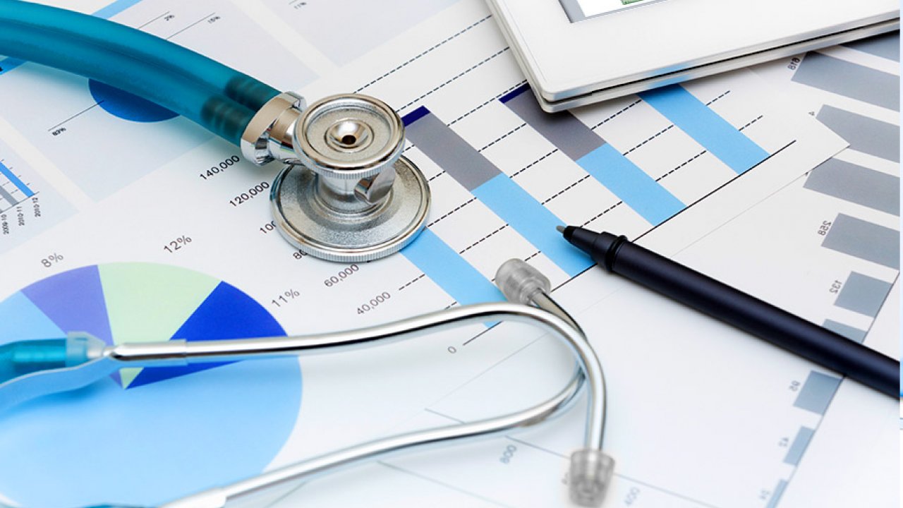
ANALYTICS IN HEALTHCARE

Traditionally, healthcare has always used statistical analyses in clinical research. However, with the recent massive explosion of structured and unstructured data from the digitization of patients’ health records (EHR), hospital inpatient claims data, machine generated/sensor data, analytics has become essential to enhance functionalities across multiple sectors in healthcare including public health management, hospital administration, personalized medicine and medical imaging.

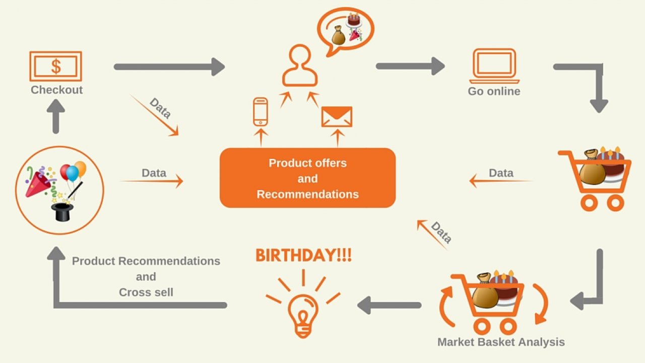
With EHR data, predictive analytics can help providers treat patients based on their past behaviours to mitigate future events, such as a diabetic ending up in the emergency room because he did not refill his medication or a child with asthma requiring a hospital admission due to environmental triggers of her disease. For e.g., in an effort to lower the rate of veteran suicides, the US army is conducting a study (Army STARR) to leverage a predictive risk model2 to identify patients who may be likely to harm themselves.Previous models used to mine the EHR data to identify patients at risk of self-harm by flagging past attempts at suicide. STARR, however, narrowed down more than 400 personal traits into a smaller set of factors that were consistently predictive of suicidal behaviour using machine learning algorithms. It then assigned a risk score using the relevant clinical data points such as prescription drug use, behavioural history, military experience, access to weaponry, age at enlistment, past conflicts with leadership, and IQ scores.

Public health management: Analytics can be used to prevent bottlenecks in supply and demand in the overall access to care. For example, University of Florida leveraged Google Maps and free public health data to identify factors of demand for medical facilities (e.g. population growth, chronic disease rates) in municipalities and compared those factors to the availability of medical services in those areas. The university located three Florida counties that were underserved for breast cancer screening and redirected its mobile care units accordingly.

Combining historical medical literature, google maps, geographical and socio economic conditions and free public health data, hot spots for disease outbreaks can be identified and contained. Let’s take the research which was jointly conducted by IBM with John Hopkins University and University of California at San Francisco 5 as an example. Merging information on changes in rainfall, temperature, soil acidity to gauge the population of wild animals and insects of a particular geography with other public data like transportation and airport and highway traffic they were able to establish a pattern in dengue and malaria outbreaks in the states of Texas and Florida.

Another method to track outbreaks can be disease networking. Use of big data analytics to study the timing and location of search engine queries, consumers’ posts on social networks to predict disease outbreaks can potentially support key prevention programs such as disease surveillance and outbreak management. Case in point, Researchers at the Johns Hopkins School of Medicine used data from Google Flu Trends to predict sudden increases in flu related emergency room visits at least a week before warnings from the CDC.6 Likewise, using social media analytics on Twitter updates to track the spread of cholera in Haiti after the January 2010 earthquake was as accurate as (and two weeks ahead of) official reports.

Analytics used in hospital administration: A major difficulty for hospitals is to provide interventions and care such that patients’ readmission rates are reduced. A hospital readmission is when a patient who had been discharged from a hospital is admitted again to that hospital or another hospital within a specified time frame. Time frames can differ across studies with the most common being 30-day, 90-day, and 1-year readmissions. Avoidable readmissions mainly occur because the patient’s initial problem remains unresolved or because of the patient’s mismanagement/ misunderstanding of their condition. Leveraging EHR and socioeconomic data derived factors (e.g. patient’s current length of stay, acuity of admission, number of ED visits in the previous six months, functional status, discharge hospital ward, housing discontinuities, drug use), classification algorithms like random forests, SVM are used to create a risk readmission scorecard. Each patient who is admitted is assigned a risk score on the basis of which healthcare providers implement timely interventions to reduce the number of the patient’s visits to the hospital.

Personalized/precision medicine: It involves using patients’ individual characteristics (e.g. genome sequence, microbiome composition, health history, lifestyle, diet, environments) to enable health care providers to tailor treatment and prevention strategies for each patient. It requires the ability to classify individuals into subpopulations that differ in their susceptibility to a particular disease, the morphology of the disease or in their response to a specific treatment. This can be achieved by using panomics (molecular biology techniques like genomics, proteomics) and systems biology9 to analyse the cause of an individual patient’s disease at the molecular level and then use targeted therapy to address that individual patient’s disease progress. The patient’s response is then tracked closely and the treatment finely adapted to the patient’s response.

Thus, insight into disease mechanisms is necessary to developing targeted therapies. A major goal in genomic research is to predict phenotypes (traits of an organism influenced by interaction of its genes with its environment) from a genotype (inherited instructions it carries within its genome) as phenotypes are studied to understand disease risks.

Yet even within a single cell, the genome directs the state of the cell through many layers of intricate and interconnected biophysical processes and control mechanisms. Analysing just the genotypes to infer results on phenotypes does not give sufficient information on the disease mechanisms. As a result, the subsequent targeted therapies may not be effective. It can be counteracted by training a supervised machine learning algorithm (e.g. neural networks) to predict measurable intermediate molecular functions (e.g. the distribution of proteins along a transcript, concentration of proteins) which can then be linked to phenotypes.

Medical imaging uses learning algorithms to analyse data contained within medical images to detect distinct patterns. Given a collection of images, dimensionality reduction and feature extraction techniques are applied to derive relevant biomarkers (colour layout, edge histogram, colour edge direction and colour texture). The biomarkers are then weighted by classifier algorithms (e.g. SVM classifier) to detect patterns/anomalies. The updated images are further reviewed by diagnosticians and the feature weights in the classifier algorithms are trained accordingly for subsequent iterations. However, image analytics can be further used to assist physicians in reducing varying subjective interpretation and human error, thereby accelerating the process of treatment and recovery. For e.g.,11 researchers in China have found that their machine-learning computations separate malignant from benign properties more accurately than an inexperienced radiologist—but not as accurately as the experienced radiologist whose know-how was used to create the algorithms.

Two radiologists reviewed ultrasound images of 970 histopathologically proven thyroid nodules in 970 patients and their findings were compared with machine-building algorithms: the Naïve Bayes classifier, the support vector machine, and the radial basis neural function network. The results showed the experienced radiologist of 17 years achieved the highest predictive accuracy of 88.7% with a specificity of 85.3%, whereas the radial basis function (RBF)–neural network (NN) achieved the highest sensitivity of 92.3%. However, the algorithms were more accurate than the inexperienced radiologist, who had only 3 years’ similar experience.

blog grid image

MARKET BASKET ANALYSIS

Market basket analysis (MBA) is a modelling technique, traditionally used by retailers, to understand customer behaviour. It is derived from affinity analysis and association rule learning which implies connections between specific objects by examining the significance of the co – occurrence of the objects among specific individuals or groups. In the context of a supermarket or a retail store, market basket analysis would try to find the combination of products that frequently co – occur in transactions, e.g. people who buy bread and eggs, also tend to buy butter (as a high proportion of them are planning on making an omelette).1

Brick and mortar stores use the insights gained from MBA to drive their sales by creating store layouts where commonly co-occurring products are placed near each other to improve the customer shopping experience. It is also used to cross sell different products, e.g., customers who buy flour are targeted with offers on eggs, to encourage them to spend more on their shopping basket.

A few other examples on how MBA is used are2

  • Product recommendation by online retailers, e.g. Amazon’s customers who bought this product also bought these products…
  • Placement of content items on web pages
  • Optional services purchased by telecommunications customers (call waiting, call forwarding, DSL, speed call, and so on) help determine how to bundle these services together to maximize revenue
  • Unusual combinations of insurance claims are indicative of fraud
  • Medical patient histories can give indications of likely complications based on certain combinations of treatments.

Terminology 3

Items are the objects that we are identifying associations between. For a retailer, an item will be a product in the shop. For a publisher, an item might be an article, a blog post, a video etc. In association analysis, a collection of zero or more items is called an itemset.

Transactions are instances of groups of items co-occurring together. In a store, a transaction would generally be summarized in the receipt. The receipt would be a list of all the items bought by a single customer.

Market basket data can be represented in binary form where each row represents a transaction and each column represents an item. An item being purchased is treated like a binary variable and is given the value of 1 for purchase in a transaction and 0 otherwise. The binary representation, however, does not account for the quantity of item in the transactions, only its presence/ absence.

Rules provide information in the form of if – then statements.

X ⇒Y

i.e. if a customer chooses the items on the left-hand side of the rule (antecedent i.e. X), then it is likely that the customer will be interested in the item on the right-hand side (consequent i.e. Y). The antecedent and consequent are disjoint and should have no items in common. Thus, in the example of bread and eggs, the rule would be:

{bread, eggs} ⇒{butter}

The output of a market basket analysis is generally a set of rules, which are then used to make business decisions.

The support of an item or itemset is the proportion of transactions in the data set that contain that item or itemset. Thus, it indicates the popularity of the item. For super market retailers, this is likely to involve basic products that are popular across an entire user base (e.g. bread, milk). On the other hand, a printer cartridge retailer may not have products with a high support, because each customer only buys cartridges that are specific to his / her own printer.

Confidence of a rule is the conditional probability that a randomly selected transaction will contain items on the consequent of the rule, given the presence of items on the antecedent of the rule.

It is merely the likelihood of the consequent being purchased as a result of purchasing the antecedent. Rules with higher confidence are ones where the probability of an item appearing on the consequent is high given the presence of the items on the antecedent.

The lift of a rule is the probability of co-occurrence of the items on the antecedent and consequent divided by the expected probability of the occurrence of the items on the antecedent and consequent if the two were independent.

  • Lift > 1 suggests that the presence of the items on the antecedent has increased the probability that the items on the consequent will occur on this transaction.
  • Lift < 1 suggests that the presence of the items on the antecedent has decreased the probability that the items on the consequent will occur in the transaction.
  • Lift = 1 suggests that the presence of items on the antecedent and consequent are independent i.e. presence of items on the antecedent are present does not affect the probability that items on the consequent will occur.

Rules with a lift of more than one are generally preferred while performing a market basket analysis.

Example: A sample of 15 transactions from a grocery store shows purchases of five items: bread, apples, jam, flour and ketchup. The grocer wishes to know the popularity of bread and jam. He also wants to know if the sale of jam is dependent on bread.

Thus, bread and jam prove to be most popular as shown by high support values. Lift of 1.1 also suggests that the sale of jam has been influenced by the sale of bread.

Typically, a decision maker would be more interested in a complete list of popular itemsets than know the popularity of a select few. To create the list, one needs to calculate the support values for all possible configuration of items and shortlist frequent itemsets that meet the minimum support threshold to arrive at meaningful associations using confidence/lift values. Thus, the entire process can be divided into two steps:

  • Frequent itemset generation
  • Rule generation

Frequent itemset generation can become computationally expensive as the number of possible configurations for k items is 2k – 1. Thus, for 5 items, the number of itemsets would be 31; for 10 items, it would be 1023 and so on. This necessitates an approach to reduce the number of configurations which need to be considered.

Apriori algorithm 4 is the most widely used algorithm to efficiently generate association rules. It is based on the Apriori principle.

Apriori principle:

  • If an itemset is frequent, then all its subsets must also be frequent
  • if an itemset is infrequent, then all its supersets must also be infrequent

The Apriori principle holds due to the anti-monotone property of support which states that the support of an itemset never exceeds the support of its subsets.

Apriori algorithm uses a “bottom up” approach to generate frequent itemsets:

Step 1. Let k=1. All possible itemsets of length k are generated. These are known as candidate itemsets.

Step 2. The itemsets whose support is equal to or more than the minimum support threshold are selected as the frequent itemsets.

Step 3. The following steps are repeated until no new frequent itemsets are found.

  • Candidates itemsets of length k+1 are generated from frequent itemsets of length k.
  • Candidate itemsets containing subsets of length k that are infrequent are removed (Pruning)
  • >Support of each candidate itemset of length k+1 is calculated.
  • Candidates that are found infrequent based on their support are eliminated, leaving only frequent itemsets.

5Example: A sample of five transactions are taken. A minimum threshold support of 40% is chosen.

Apriori principle is again used to identify item associations with high confidence or lift to generate rules. Finding rules with high confidence or lift is less computationally taxing once high-support itemsets have been identified, as confidence and lift values are calculated using support values of the remaining frequent itemsets.

Since, distribution of items differs across businesses, it is expected that support and confidence parameters will change according to the organization. Thus, it is required for organisations to experiment with different parameters. However, rules generated from low parameters should be treated with caution as they can indicate spurious associations.

blog grid image

RANDOM FOREST - AN OVE...

Random forest is a technique to bring down the noise while developing a prediction model. This noise is often called over-fitting.

A prediction model comes with its bias and variance factors. Bias is the difference between actual value and the predicted value. Variance, as we know, is the mean of squared differences between predicted values and their mean value. One would, definitely like to, aim for a minimum variance (i.e. range of predicted values to be aptly low) and unbiased model, which also is called minimum variance unbiased estimator (MVUE). In order to create an apt model of MVUE type however, at times, noise is introduced into the prediction model.

Thus, when a model is getting trained, in addition to the training error (or bias, which is removed through cross-validation in general machine learning algorithms), there is a scope of inducing generalization error (or noise). This phenomenon is called over-fitting and, unless treated, will add error to the predicted data. Random Forests are known to wipe this error out.

As it sounds obvious, Random Forest is a collection of (decision) trees. It will add value to this discussion, if we stop-by, briefly, at the concept of Decision Tree, before we proceed further. In fact, you will start to appreciate Random Forest technique, post this brief stop-by.

Decision Trees are the classifier models that help in segregating the instance space, i.e. the dataset at hand. They work on the basic fact that such instance spaces are attributed. Attributes are the features that may be segregating a space for good. Thus, it is seen that such attribute, which have highest variance over the instance space, be taken in priority, followed by the subsequent ones, at a given node to segregate the space further – this is also referred as entropy, which helps in division of the instance space2. More the entropy more is the information received about the space and hence, better is the division of the same. Let’s look at an instance space and the adjoining decision tree to understand this better.

The below basketball game data is the data space3, which we shall use to train and develop a decision tree. We use the value for information gain to choose an attribute once (only) along each route of this decision tree. For that, we always divide the instances at a given node into 2 classes, say W and L, as per the final target concept (Won and Lost in this case).

Gain (at a node) = [Entropy at that node or -p(W) X log2(p(W)) - p(L) X log2(p(L)) ] – [Expected Entropy subsequent to partitioning or WS/(W+L) X p(Ws) X log2(p(WS)) - LS/(W+L) X p(Ls) X log2(p(LS)) ]

For example, at root node, we find that while using the “When” attribute, maximum value for information gain is achieved.

Entropy of 1st set, H(5pm) = -1/4log(1/4) - 3/4log(3/4)

Entropy of 2nd set, H(7pm) = -9/12log(9/12) -3/12log(3/12)

Entropy of 3rd set, H(9pm) = -0/4log(0/4) -4/4log(4/4)

Expected Entropy after partitioning = 4/20*H(5pm)+12/20*H(7pm)+4/20*H(9pm) = 0.65

Information Gain = 1-0.65 = 0.35

Division along a certain path in the tree may stop if all the attributes are expended in that path or the entropy for the values at that node is 0 (essentially, all the values at that node belong to the same class).

This is how division at each node has happened and the complete tree, shown above, is designed. You can see, one may need to recursively use an attribute (except the base attribute, which in above case was “When”) across different paths of the tree based on the concept of Information Gain. You can refer my earlier blog to see CHAID algorithm at work in developing a Decision Tree.

Random Forest was introduced in order to leverage on the tumultuous task, which happened while formulating a decision tree, and to chisel away any noise from this tree.

The trees in Random Forest are formed by shaping them with the help of randomly selected training data (with replacements)4. Here is an illustration to that effect5.

In Random Forest there is no test set for cross-validation to remove the bias; instead, through the above shown process of bootstrapping, subsets of data from training data are randomly picked up to shape the individual decision trees according to each of these subsets. The rule of thumb is to use 2/3rd of total data for this process of generating decision trees. These decision trees are combined to give a resulting prediction and the model, thus formed, is called Random Forest. The combination, often termed as aggregation, is either by the process of averaging the output (for regression lines based problems) or by majority-voting (for classification type problems, e.g. whether next branch’s mango is sweet or sour)6. In case of binary dependent variable, the votes will be either a YES or NO and the number of YES will be the RF score; in regression, it is the average value of dependent variable7. The total process to generate the RF score is termed as bagging (Bootstrap Aggregating).

An example, where a regression based problem is applied with the process of bootstrapping, can be found at this link.

The datasets, which remain after the above random selection, are often referred as OOB (out-of-bag) and used for further validation and approximation of any generalization error. According to the popular practice, 1/3rd of total data is used for this validation process. This also confirms the requirement that the building blocks (i.e. datasets used in developing this random forest) and the OOB, for the model, are co-located for validation.

A very naïve example to explain the purpose of Random Forest would be the approach to obtain the answer to this question –Are teenagers always up to trouble? If your responding set, of people, contains mostly of old guys, you are sure to get a biased collective response. However, if the set contains a diversified ensemble of people (i.e. people from different age groups), it will remove the bias and improve the validity of the responding statement. Similarly, if you have a bagged ensemble of diverse decision trees, which is created from one training data, as described in the above sections, the chances of getting accurate predictions, almost all the time, increases manifolds.

blog grid image

DECISION TREES WITH CH...


Decision Trees are very popular analytical tool used by business managers. Their popularity hinges upon their simple representation in terms of graphs and easy to implement as a set-of rules in the decision making process. Decision Trees have a tree-like graph of decisions and their possible consequences.  Decision Tree is a supervised machine learning algorithm, mostly used for classification problems where the output variables are binary or categorical. A supervised algorithm is one, where training data is analyzed to infer a function that can be used for mapping new data1. Typically supervised learning algorithm will calculate the error and back propagate the error in an iterative method to reduce error until it converges2. Trees are an excellent way to deal with complex decisions, which always involve many different factors and usually involve some degree of uncertainty3.


For example,  think about a classification problem where one has to decide who will play cricket from a sample of 30, based on three variables (or factors) – Gender (Male or Female), Class (IX, X), Height (<5.5 ft, >=5.5 ft). The variable that splits the sample into most homogeneous sets of students (i.e. sets being heterogeneous to each other) is the most significant variable. In the following display, Gender becomes the most significant variable, as it splits the sample into most homogeneous sets


Components of a Decision Tree –   


  • The Decision, displayed as a square node with 2 or more arcs pointing to the options.

  • The Event Sequence, displayed as a circle node (and are called sometimes as “chance nodes”) with 2 or more arcs pointing out the events; at times, probabilities may be displayed with the circle nodes.

  • The Consequences or endpoint, also called as a “Terminal” and represented as a triangle, are the costs or utilities associated with different pathways.


Decision trees have a natural “if...then...else” construction, that makes them easier to fit into a programmatic structure6. They are best suited to categorization problems, where attributes or features are checked to arrive at a final category. For e.g., a decision tree can be used to effectively determine the species of an animal.

Decision trees owe their origin to ID3 (Iterative Dichotomiser 3) algorithm, which was invented by Ross Quinlan7. The ID3 algorithm uses the popular Entropy method to draw a decision tree, and this method is discussed in more detail in an upcoming blog on Random Forest. However, there came another algorithm called CHAID (Chi-square Automatic Interaction Detection), which was developed by Gordon Kass8, and which would help making the decision to select the order of choosing categorical predictors and branch the categories appropriately to form splits at each node, thus forming the decision tree. In the rest of this blog, I will take a shot at explaining Decision Trees formed by applying chi-square tests.

In a decision tree, the 1st step is that of feature (variable) selection in order to divide the tree at the very 1st level. This will require to calculate the chi-square value for all the predictors (if there are any continuous variables, they need to transform into categorical).

Let’s assume a dependent variable having d>=2 categories and a certain predictor variable in the analysis having p>= 2 categories.


A, B, C, D, E and F denote the observed values and EA, EB, EC, ED, EE and EF denote the expected values.

As the considered categories for this predictor variable are considered to be 3 significantly independent events, it can be said that probability of category p1 occurs in the positive class instances is equal to the probability that category p1 occurs in all the instances of the 2 classes9.

Thus, EA/ (A+C+E) = (A+B)/N

Or EA= M X (A+B)/N

Similarly, EB, EC, ED, EE and EF can be calculated.

Thereafter, we can calculate the chi-square test for this predictor variable as


 where, Ok and Ek are observed and expected values respectively and df is the degree of freedom. which is 2 [ i.e. (no. of categories in predictor variable – 1) X (no. of categories in dependent variable – 1)] in this case.

Let’s see how the above equation is constructed with the help of a sample data about gender distribution among various occupations in an area as follows.


Chi-square value for the Predictor called Occupation is
       
       = 1.819

 The predictor variable (say Xi) having the highest chi-square value will be selected to form the branch at a particular level of the decision tree


 The use of chi-square tests adds efficiency in the form of apt no. of splits for each categorical predictor. This method to split efficiently is called as CHAID. Suppose, while forming the decision tree, at a level of the decision tree, there is a predictor with maximum chi-square value. Hereafter, the following steps10 are undertaken to get the apt no. of splits using the predictor:


  1. Cross-tabulate each predictor variable with the dependent variable and take steps 2 and 3    

  2. For this predictor variable, find the allowable pair of categories whose (2 X categories in dependent variable) sub-table is least significantly different; if this significance level is below the critical level, merge these 2 categories and consider them as a compound category. Repeat this step

  3. For each compound category, having more than 2 of original categories, find the most significant binary split and resolve the merger into a split if this significance level is beyond the critical level; in case a split happens, return to step 2

  4. Calculate the Χ2or significance level for the optimally merged predictor; if this significance is greater than a criterion value, split the data at the merged categories of the predictorThe census data from UCI Machine Learning Repository is taken to explain the process above. Let’s just pick only the categorical independent variables (6; for simplicity, I have removed Country and gender variables) for this exercise. Snapshot of data is presented below. The data is used to predict whether someone makes over $50k a year (a positive event) or not (a negative event). 

  5.  


The 1st step is that of feature selection by calculating the chi-square value for each predictor and choosing the predictor with highest value (relationship in this case).


Next step is to efficiently split the data at relationship level, i.e. choosing the right no. of categories. For this the significance test at stage of merging the categories will give the apt no. of branches – in this case, it is the combined categories of Husband with other non-Wife categories and Wife category as shown in the green portion below.


Thus, the 1st node of the tree would look like below.


Let’s show the split at Wife Node. We will follow the above mentioned steps to find the best feature and then optimize the split w.r.t. that feature, i.e. merge the allowable categories in the chosen predictor. The predictor occupation is selected at this node to split the sample collected at Wife Node. Various mentioned occupations are combined &colour-coded to form 4 groups – white collar jobs (white), blue collar jobs which need speciality (blue), jobs which don’t need much supervision (green) and others (grey).This grouping is done purely on my understanding for the purpose of this study and doesn’t intend to have bias of any sort; apologies, if there is any. After that, the categories of occupation predictor are combined to give an optimal split under the Wife Node.


The tree is completed following the above steps for each node at all the levels. No. of levels, or the tree depth, can’t exceed no. of predictors in the data. Another stopping criterion is when the node is pure11 (i.e. only one category from the target or dependent variable is present in the node). Ideally, a decision tree should have max 3 or 4 levels – too many levels tend to make a tree over-fit (more on this one in the next blog on Random Forest) and hence biased during future predictions. Moreover, the nodes should have size greater than 3% (can also be set at 5%) of the entire training sample to be representing a decision node; otherwise, we stop any further division at that node.

Decision Trees are greedy algorithms, i.e. they have a tendency to over-fit. Hence, at times they need to undergo the process of Pruning12, which is a method to decrease the complexity of the classifier function, i.e. reduce the no. of features required to classify the training sample into one of the options from target variable. Caution is taken during the Pruning process to not affect the predictive accuracy of the decision tree. The complete Decision Tree formed from the above UCI data is shown below (level of the tree is 3).


 We will finish this blog by showing the efficiency of the Decision Tree, where we will compare its performance with a random generator (i.e. one where you guess 50% as positive and rest 50% as negative events from a sample). Considering each of the 6 nodes (as numbered above) as samples, we can plot a gain/lift chart and check the average lift from this algorithm.

blog grid image

VALUE AT RISK A PLACEB...

Value at Risk (VaR) is a measure of the risk of investments. It estimates how much a set of investments might lose, given normal market conditions, in a set time period such as a day. VaR is typically used by firms and regulators in the financial industry to gauge the amount of assets needed to cover possible losses.

A VaR statistic has three components: a time period, a confidence level and a loss amount (or loss percentage). If a portfolio worth $1million has a one-day 5% VaR of -0.82% (or loss of $8.2k) , that means that there is a 5% probability that the portfolio will fall in value by more than $8.2k over a one-day period if there is no trading.

The History

First attempts to measure risk and thus express potential losses in the portfolio, are attributed to Francis Edgeworth and dates back to 1888. He made important contributions to the statistical theory, advocating the use of data from past experience as the basis for estimating future probabilities.

The origins of VaR can be further traced to capital requirements for US securities firms of the early 20th century, starting with an informal capital test the New York Stock Exchange (NYSE) first applied to member firms around 1922. The original NYSE rule6 required firms to hold capital equal to 10% of assets comprising proprietary positions and customer receivables.


History of the VaR continued in 1945, when Dickson H. Leavens created a work that is considered the first mention of VaR-like risk measure although he did not use name value at risk. He attempted to measure the value of the portfolio of ten independent government bonds which would either reach maturity amount of $1,000 or become worthless. He mentioned the notion of "the spread between the likely profit and loss" and that most likely mean standard deviation, which is used to measure risk and is an important part of VaR.

In 1975, the US Securities and Exchange Commission (SEC) established a Uniform Net Capital Rule (UNCR) for US broker-dealers trading non-exempt securities. This included a system of “haircuts” that were applied to a firm’s capital as a safeguard against market losses that might arise during the time it would take to liquidate positions .Volatility in US interest rates motivated the SEC to update these haircuts in 1980. The new haircuts, a VaR like metric, were based upon a statistical analysis of historical market data. They were intended to reflect a 95% -quantile of the amount of money a firm might lose over a one-month liquidation period.

The credit for the use of current VaR is attributed mainly to US investment bank JP Morgan. In 1994, its chairman, Dennis Weatherstone asked for something simple that would cover the whole spectrum of risks faced by the bank for the next 24 hours. The bank developed, using Markowitz portfolio theory, the VaR. But at that time it was called 4:15 report, because it was handed out every day at 4:15, just after the market closed. It allowed him to see what every desk’s estimated profit and loss was, as compared to its risk, and how it all added up for the entire firm. However, the origin of the name “Value at risk” is unknown. JP Morgan formed a small group, called RiskMetrics, that published a technical document of this system and also posted it on the Internet so that other risk experts could make suggestions to improve it (aka Open Source Code). This was followed by the mass acquisition of the system by many institutions. VaR was popularized as the risk measure of choice among investment banks looking to be able to measure their portfolio risk for the benefit of banking regulators.

In 1996; the Basel Committee approved the limited use of proprietary value-at-risk measures for calculating the market risk component of bank capital requirements. In this and other ways, regulatory initiatives helped motivate the development of proprietary value-at-risk measures.

VaR Methods

Although various models for the calculation of VaR use different methodologies, all retain the same general structure, which can be summarized in the following steps: (i) The calculation of the present value of the portfolio (Mark-to-Market Value), which is a function of the current values of market factors (interest rates, exchange rates and so on), (ii) An estimation of the distribution of changes in the portfolio (this step is the main difference among the VaR methods) and (iii) The calculation of the VaR.

Historical Simulation

A relatively simple method where distributions can be non-normal, and securities can be non-linear. Historic approach involves keeping a historical record of preceding price changes. It is essentially a simulation technique that assumes that whatever the realizations of those changes in prices and rates were in the earlier period is what they can be over the forecast horizon i.e. assumes that the past will be repeated. It takes those actual changes, applies them to the current set of rates, and then uses those to revalue the portfolio. Profits and losses are sorted by size from the largest loss at one end to highest profit at the other end of the distribution. Then we choose from the end of losses the pre-set percentage. In practice, it tends to have a higher average value of the distribution compared to normal distribution. Also, common financial data has a fat tail, which means that the probability of extremely large positive as well as extremely large negative values is higher than in the normal distribution.

Analytical Approach

Analytical VaR has also other names such as Variance-Covariance VaR, Parametric VaR Linear VaR or Delta Normal VaR. This method was introduced in the RiskMetrics™ system. This method consists of going back in time and computing variances and correlations for all risk factors. Portfolio risk is then computed by a combination of linear exposures to numerous factors and by the forecast of the covariance matrix. For this method, positions on risk factors, forecasts of volatility, and correlations for each risk factor are required. Analytical approach is generally not appropriate to portfolios that hold non-linear assets such as options or instruments with embedded options such as mortgage-backed securities, callable bonds, and many structured notes.

After selecting the parameters for the holding period and confidence level it is possible to calculate 1-day VaR by a simple formula. Prerequisite for the use of this formula is the assumption that the change in the value of the portfolio is subject to normal distribution:

VaR1-day(α) = Z(α) * σ * Asset Value

Where:

α is the level of confidence,

σ is the standard deviation of changes (volatility) in the portfolio over a given time horizon

Z is the normal distribution statistic for a given level of confidence (α)

It is possible to calculate the T-day VaR by multiplying the 1-day VaR by the square root of T, where T represents the new holding period:

VaRT-days(α) = Z(α) * σ * Asset Value * (T)1/2

The overall VaR of a portfolio of 2 assets (a & b) is not a simple sum of the individual VaR:

VaR2portfolio = wa2 * VaRa2 + wb2 * VaRb2 + 2 * wa * wb * σa * σb * ρab

Analytical VaR of a portfolio of n>2 assets is somewhat more complex:

Where:

x = (VaR1, VaR2, … , VaRn-1, VaRn) - The vector of VaR of each asset in portfolio.

ρi j - The correlation between the ith and jth asset.


Monte Carlo

It is widely regarded as the most sophisticated VaR method and can be used when previous methods cannot be used in cases when a portfolio is characterized by fat tails or is too heterogeneous or historical data are not available. Monte-Carlo method makes some assumptions about the distribution of changes in market prices and rates. Then, collects data to estimate the parameters of the distribution, and uses those assumptions to give successive sets of possible future realizations of changes in those rates. This method based on the assumption that the risk factors that affect the value of the portfolio (or asset) are managed by a random or stochastic process (an example shown below). The random process is simulated many times (e.g., 10,000 times). The result is a simulated distribution of revalued portfolio (or asset price), as in the historic method, and the outcomes are ranked and the appropriate VaR is selected.The more simulations, the resulting distribution is more accurate. Monte Carlo method can easily be adjusted according to the distribution of risk factors. However it is computationally burdensome which constitutes a problem for routine use. It takes hours or even days to run those analyses, and to speed up analyses complicated techniques such as variance reduction need to be implemented.

St+∆t = St * exp [(µ - σ22)* ∆t + σ * (∆t)1/2 * ℇ]

S: Asset price; t: time period; ∆t: change in time; µ: expected growth rate in asset price;

σ: price volatility of asset at time t; ℇ: random variable from a standardized normal distribution

LTCM event – VaR exposed

In 1998, Long Term Capital Management - LTCM, the world’s largest hedge fund, had became one of the most highly leveraged hedge funds in history. It had a capital base of $3 billion, controlled over $100 billion in assets worldwide, and possessed derivatives whose value exceeded $1.25 trillion. The fund’s investment strategy which relied heavily upon the convergence-arbitrage and so had to have a high level of leverage in order to meet a satisfactory rate of return. LTCM believed that historical trends in securities movements were an accurate predictor of future movements. Their faith in this belief led them to sell options in which the implied volatility was higher than the historical volatility. There was an assumption that the portfolio was sufficiently diversified across world markets to produce low correlation. But in most markets LTCM was replicating basically the same credit spread trade.


To predict and mitigate its risk exposures, LTCM used a combination of different VaR techniques. LTCM claimed that its VaR analysis showed that investors might experience a loss of 5% or more in about one month in five, and a loss of 10% or more in about one month in ten. Only one year in fifty should it lose at least 20% of its portfolio. LTCM also estimated that a 45% drop in its equity value over the course of a month was a 10 standard deviation event. In other words, this scenario would never be likely to occur in the history of the universe. Unfortunately for Long-Term Capital Management and its investors, this event did happen.

In August 1998, an unexpected non-linearity occurred that was beyond the detection scope of the VaR models used by LTCM. Russia defaulted on its sovereign debt, and liquidity in the global financial markets began to dry up as derivative positions were quickly slackened. All trades which were assumed to be independent i.e. low correlation turned south together, thereby raising correlations and eliminating diversification benefits just at the moment when they were most needed. So sure were the firm’s partners that the market would revert to “normal” — which is what their model insisted would happen — that they continued to take on exposures that would destroy the firm as the crisis worsened. The LTCM VaR models had estimated that the fund’s daily loss would be no more than $50 million of capital. However, the fund soon found itself losing around $100 million every day. In the fourth day after the Russian default, they lost $500 million in a single trading day alone. As a result LTCM began preparations for declaring bankruptcy.

The US Federal Reserve, fearing that LTCM’s collapse could paralyze the entire global financial system due to its enormous, highly leveraged derivatives positions, extended a $3.6 billion bailout to the fund, creating a major moral hazard for other adventurous hedge funds. Consequently, LTCM’s failure can be attributed to VaR.

Not a Panacea for Risk Management

Past is not the Future

Unfortunately, the past is not a perfect indicator of the future. On October 18, 1987, for example, two-month S&P futures contracts fell by 29%. Under a lognormal hypothesis, with annualized volatility of 20% (approximately the historical volatility on this security), this would have been a –27 standard deviation event. In other words, the probability of such an event occurring would have been 10-160. This is such a remote probability that it would be virtually impossible for it to happen . On October 13, 1989 the S&P 500 fell about 6%, which under the above assumptions would be a five standard deviation event. A five standard deviation event would only be expected to occur once every 14,756 years. Hence VaR that uses history or known assumptions based on past patterns are not a full-proof measure as people tend not to be able to anticipate a future they have never personally experienced. Prior to 2008 debacle, all the triple-A-rated mortgage-backed securities churned out by Wall Street firms and that turned out to be little more than junk because VaR generally relied on a tame two-year data history to model a wildly different environment. It’s like the historic data only has rainstorms and then a tornado hits. “The years 2005-2006, which were the culmination of the housing bubble weren’t a very good universe for predicting what happened in 2007-2008”: this was one of Alan Greenspan’s primary excuses when he made his mea culpa for the financial crisis before Congress.


A false sense of security

Since the financial crisis of 2008, there has been a great deal of talk, even in quant circles, that this widespread institutional reliance on VaR was a terrible mistake. At the very least, the risks that VaR measured did not include the biggest risk of all: the possibility of a financial meltdown of 2008 or any financial crises of the preceding years. VaR has been relatively ineffective tool as a risk-management tool for firms to side-step potentially catastrophic moments in history. It usually creates a false sense of security among senior managers and watchdogs just like an air bag (of a car) that works all the time, except when you have a car accident. Regulators sleep soundly in the knowledge that, thanks to VaR, they have the whole risk thing under control. Even FI boards who hear a VaR number once or twice a year and if it sounds good are lulled into sleep. It is the placebo effect at work where people like to have one number they can believe in.


Can be gamed

It turns out that VaR could be gamed as it creates a perverse incentive to take more risks amongst banks reporting their VaRs. To motivate managers, the banks began to compensate them not just for making big profits but also for making profits with low risks (seemingly). Thus, managers began to manipulate the VaR by loading up asymmetric risk positions. These are products or contracts that, in general, generate small gains and very rarely have losses. But when they do have losses, they are huge. A good example is a credit-default swap, which is essentially insurance that a particular company won’t default. The gains made from selling credit-default swaps are small and steady — and the chance of ever having to pay off that insurance was assumed to be minuscule. It was outside the 99 percent probability, so it didn’t show up in the VaR number. Thus VaR gives cover to such trades that make slow, steady profits — and then eventually quickly spiral downward for a giant, brutal loss.


Blind to BlackSwans

Nassim Nicholas Taleb propounded ‘black swans’ as unexpected events of large magnitude and consequence and their dominant role in history. Such events, considered extreme outliers, collectively play vastly larger roles than regular occurrences. Risk management tools like VaR cannot credibly gauge the kind of extreme events that destroy capital and create a liquidity crisis — precisely the moment when you need cash on hand. The essential reason for this is that the greatest risks are never the ones you can see and measure, but the ones you can’t see and therefore can never measure. The ones that seem so far outside the boundary of normal probability that you can’t imagine they could happen in your lifetime — even though, of course, they do happen. The experience of LTCM is a case in point. More recently the Best Picture faux pas at the Oscars was also a black swan event.

Leverage ignored

VaR does not properly account for leverage that was employed through the use of options. For example if an asset manager borrows money to buy shares of a company, the VaR would usually increase. But say he instead enters into a contract that gives someone the right to sell him those shares at a lower price at a later time — a put option. In that case, the VaR might remain unchanged. From the outside, he would look as if he were taking no risk, but in fact, he is.

Liquidity risk not Measured

One of VaR’s flaws, which only became obvious in 2008 financial crisis, is that it didn’t measure liquidity risk — and liquidity crisis is exactly what banks encounter in the middle of a financial downturn. One reason nobody seems to know how to deal with this kind of crisis is because nobody envisions the dynamics of a liquidity imbroglio and VaR doesn’t either. In war you want to know who can kill you and whether or not they will and who you can kill if necessary. You need to have an emergency backup plan that assumes everyone is out to get you. In peacetime, you think about other people’s intentions. In wartime, only their capabilities matter whereas VaR is a peacetime statistic.


User determines VaR Potency

However, VaR is just the messenger and people interpreting the message are the source of the problem. A computer does not do risk modelling but people do it. Therefore laying the blame at the doorstep of a mathematical equation seems trivial. You can’t blame math, just as it is not the car it is the guy behind the wheels who dictates whether he is going to meet with an accident. An incident at Goldman Sachs prior to 2008 crisis makes the point.


Reporters wanted to understand how Goldman had somehow sidestepped the disaster of 2008 that had befallen everyone else. What they discovered was that in December 2006, Goldman’s various indicators, including VaR and other risk models, began suggesting that something was wrong. Not hugely wrong, but wrong enough to warrant a closer look. In December Goldman’s mortgage business lost money for 10 days in a row. So Goldman called a meeting of about 15 people, including several risk managers and the senior people on the various trading desks to get a sense of their gut feeling. A decision was made, after getting an all round sense that it could get worse, that it was time to rein in the risk. The bank got rid of the mortgage-backed securities or hedging the positions so that if they declined in value, the hedges would counteract the loss with an equivalent gain. And that’s why, back in the summer of 2007, Goldman Sachs avoided the pain that was being suffered by Bear Stearns, Merrill Lynch, Lehman Brothers and the rest of Wall Street. Goldman Sachs acted wisely by reading the faint cautionary signals from their risk models and making decisions on more subjective degrees of belief about an uncertain future.

Conclusion

VaR is a useful risk management tool when the numbers seem off or when it starts to miss targets on a regular basis. It either means that there is something wrong with the way VaR is being calculated, or it means the market is no longer acting normally. It tells you something about the direction risk is going and should caution risk managers to be on the alert.

VaR worked for Goldman Sachs the way it once worked for Dennis Weatherstone — it gave the firm a signal that allowed it to make a judgment about risk. It wasn’t the only signal, but it helped. It wasn’t just the math that helped Goldman sidestep the early decline of mortgage-backed instruments. But it wasn’t just judgment either – rather it was both. The problem on Wall Street at the end of the housing bubble is that all judgment was cast aside whereas the math alone was never going to be enough.

In the end: Nothing ever happens until it happens for the first time.

blog grid image

FINTECH AND BANKS: CON...

Part II – Friends or Foes

The second and final part of the blog lays out the various trends that one foresees in the FinTech space that Banks will have to adopt or adapt to in order to stay in the game. However, first they have to be mindful of the inherent failings that would need a huge overhaul within traditional setups to take on the challenge posed by the new agents of change. Eventually the Banks will have to resolve the dilemma of whether they should consider aligning or going-it-alone unless they want to stay rigid and wither away. In 1997, Bill Gates predicted the eventual demise of banks: “We need banking but we don’t need banks”.

Trends in FinTech courtesy Analytics

Consumer Banking

There is increasing development and integration of software-as-a-service (SaaS) into banking operations which foster moving away from physical channels towards digital/mobile delivery in order to improve customer experience. SaaS helps streamline operational capabilities and assists in offering customers a wider array of options, unlimited global access, round the clock service, which can be constantly upgraded. Through SaaS, businesses are now organising around the customer rather than product or channel. For example, Bancorp provides middle-ware platform (licenses, processing and integration) for a fast and cheap launch of FinTech start-ups.

Payments and Fund Transfer

Mobile smartphone adoption has led to consumer expecting immediacy, convenience and security of payments. Also, consumers have begun to expect a consistent omni-channel experience making digital wallets key to stream-lining user experience and reduce customer friction. There is greater demand for solutions that leverage biometrics for fast robust authentification coupled with obfuscation technologies such as tokenisation. Speed, security and digitisation will be growing trends for the payments ecosystem. Toastme allows unbanked expatriates to send money back home instead of queuing at Western Union.

Asset/Wealth Management

There is increased sophistication of data analytics to better identify and quantify risk. Wealth managers are increasingly using analytics to form a more holistic view of customers to better anticipate and satisfy their needs. Increasingly low cost and affordable automated advisory capabilities are becoming a pre-requisite for the multi-trillion dollar wealth management industry to tap into the virgin territory of small retail investors. For example Yodlee, a cloud-based platform, looks at past earning and spending behaviour to offers range of fiscal advice unique to the individual.

Technology

According to predictions by Gartner1, by 2018 20% of all business content will be authored by machines, 45% of fastest-growing companies will have less employees than smart machines and 3million+ workers will be supervised by robo-bosses. Key technologies to watch out for in the analytics space are

(i) Hadoop: mainstreaming of Hadoop as commercial vendors aggressively plug gaps for production (data security, governance etc). Extract, Hadoop and load (EHL) will gain popularity over extract transmit and load (ETL). Hybrid architectures where traditional enterprise data warehouse vendors have created connectors with Hadoop will continue to gain currency.

(ii) Apache Spark: already the most popular open source project in the Hadoop ecosystem will see increasing adoption over Hadoop’s original MapReduce for real-time analytics including stream processing and machine learning.

(iii) Next generation EDW will focus on real-time intelligence. In-memory databases like memsql are seeing increased adoption.

(iv) Cloud-based analytics – will gain wider adoption, AWS and Azure will continue to lead and mature their PaaS (platform as a service) offerings while new DBaaS (database as a service) offerings like Snowflake and IBM Cloudant will gain acceptance.

(v) Machine Learning - Predictive analytics powered by machine learning has taken off and will continue to grow. However quality data will be a challenge as data silos need to be bridged.

(vi) Deep Learning/AI – There will be increasing venture capital funding for AI start-ups. Deep learning will gain adoption in image recognition and language understanding.

(vii) IoT – BY 2020, Gartner2 has predicted that 25bn IoT devices would have come online whereas Cisco3 has forecasted a more aggressive number of 50bn devices (linking tires, roads, cars, supermarket shelves and even cattle!). Cloud vendors like AWS, Azure have come up with targeted cloud offerings for IoT.

Blockchain

It is a combination of a number of mathematical, cryptographic and economic principles without the need for a third party validator or reconciler into a decentralised distributed ledger system. Just as ERP (Enterprise Resource Planning) software allows optimisation of business processes within a corporation blockchain allows entire industries to share data with different economic objectives. Currently it is a low priority for most FinTechs/Banks due to low level of familiarity but there is increasing inquisitiveness. With time, adoption of blockchain will result in highly efficient business platforms due to huge cost-savings in back-office, increased transparency that is positive from an audit & regulatory standpoint & automate & speed up manual and costly processes. It is estimated4 that blockchain has the potential to reduce settlement time, from 3-days to 10-minutes, and 99% of settlement risk exposure in capital markets.

Key Challenges for Banks

The incumbent Banks are becoming (i) displaced by superior customer experience and price offerings (ii) diminished through revenues in a difficult customer retention environment and (iii) dis-intermediated by new technologies, due to underlying structural weakness and some of them are as follows:

Customer vs Product Centricity

Banks continue to run on a business model where the wealthiest command a customer-centric relationship while everyone else gets a product-centric approach which runs completely contrary to the current trend of customer specificity. Banks are at a huge disadvantage in an environment where there are increasing demands and expectations by customers, with more and more Millenials coming onstream, for a personalised customer experience and no longer satisfied with a one size fits all approach.

Culture

By design big sized banks tend to be burdened by their size and global reach into having a conservative and bureaucratic culture that is averse to change and taking risk. Hence they are usually slow at the uptake when it comes to new opportunities that arrive at the scene. Also, Banks are hesitant to explore new business models that could cannibalise or compete with existing ones. Given the pace of development in analytics, Banks are handicapped to stay abreast with changing times ab initio and require a long transitionary period to internalise the nimble and dynamic culture of FinTechs.

Talent

Banks have to compete with all industries for the same type of skills and technology savvy Millenials (Generation X and Y) don’t view banking as the most attractive career. Also, given the constraints in freedom and lack of innovation within Banks, it makes them less appealing to up and coming talent. Also existing work force are less in tune with latest developments in analytics and tend to guard their own turf which makes adopting change even more difficult. Also, staff is not trained to easily access and learn from large swathes of internal data and garner important insights for business.

Resources

As the saying goes ‘too many cooks spoil the broth’. Similarly, Banks are burdened with multiple priorities: reducing costs in a low interest environment, the economy not doing too well, regulatory pressures of compliance, constant monitoring of risk across diverse business areas have led to not enough resources being allocated for building strong analytics platform. Also, with a very high cost of compliance it’s harder to deliver change at the rate of agile FinTechs.

Non-urgency

Despite increasingly ceding space to FinTechs, recent study5 shows that only 47% of the largest regional/national banks (asset size of $10bn+) in the US rank improving data analytics as amongst the top 3 priorities and is even lower, at 8%, for community banks and credit unions.

Collaboration or Competition

There are 2 types of FinTechs, the first ones to arrive on the scene were challengers to incumbent Banks. The second wave of FinTechs were collaborative that wanted to enter into a mutually beneficial arrangement with Banks and enhance the position of incumbents. Initially it was easy for competition to catch the incumbents unaware and first target less profitable segments and then attack core banking. But the Banks are beginning to fight back and so there is a greater willingness by FinTech to turn collaborators as they lack the financial muscle and need access to critical consumer data in possession of Banks. According to Accenture report6, collaborative FinTechs in 2015 represented 44% of total as opposed to 29% in 2014 and this trend is expected to continue. Also with time FinTechs will face the Spiderman dilemma: “With great power comes great responsibility”. Similarly, with increased scale and global reach FinTechs will become too critical a risk to be left out of the clutches of regulators. Hence this is another reason to closely partner or merge with Banks to benefit from their rigorous experience of complying with torturous regulations and a safety net that protects them from any adverse financial impacts incase of careless breaches.

Also, there is reciprocity by the Banks as they have begun to ride the FinTech wave with 3 strategies that are mostly based on the principle of “If you can’t beat them join them”: Option 1 - invest in FinTech start-ups , Option2 – Create partnerships/joint ventures with FinTech, Option 3 - create internal R&D labs from scratch.

Out of the 3 strategies the third option is the most difficult for Banks to adopt since they lack the basic culture of FinTech and it is extremely difficult to internalise an attitude that is alien to banking and rid themselves of legacy processes, technology and even people. If Banks were to go it alone the best bet is to create a standalone organisation (Beta Bank), quarantined from the older business model, with a separate leadership, culture, technology and talent pool where incubation of the latest innovations is possible with fewer constraints.

The first 2 options create a symbiotic relationship between the two where FinTechs have the better machines (advanced analytics, digital technology) whereas Banks have the fuel (consumer and transaction data and past patterns) and much needed financial muscle which when working together synergistically will arrive at superior solutions/platforms. Hence Analytics is the glue that binds them together in an age where customer experience has taken centre stage and customer expectations have risen dramatically as the world is awash and drowning in data courtesy the digital era. Banks and FinTech will have to join forces to stay ahead of the game by utilising cutting-edge algorithms and analytical tools on ever expanding data.